Exam Practice Question - GQ
Component 1: Section A – Question 1a) (b) and (c) – 55 minutes
Explore how the front cover for GQ uses the following elements of
media language to create meanings:
(a) images [5]
(b) language [5]
(c) layout and design [5]
Explore how the front cover for GQ uses the following elements of
media language to create meanings:
(a) images [5]
(b) language [5]
(c) layout and design [5]
1A) The front cover of pride uses images on the front cover to show conventions, for example, Dwayne Johnson's stare at the audience is suppose to look at the stern image at the audience. This could show that there is a stern view to the audience, this is shown by his bicep. The use of his bicep shows that he has physical strength along with mental strength that he is looking at the audience. The T-shirt that he is wearing is most likely a muscle fit T-shirt, this is used to define his top, muscle, this reinforces the idea that there is a strong presence and is shown through the use of actor performance.
Another key element to mention is the use of the curled up fist, this shows anger trough strength, this is done through the use of actor performance, this could be a political stance but is more likely to appeal to the spornoxexuals who read this magazine and show that they are showing a strong male performance.
1B) It is also key to mention the use of language, the use of the name of the person, "The Rock !(with a bull as the dot)" shows that there are a strong presences, again for the spornosexuals who read this, and instead of emphasizing his name, emphasizing his nickname which gives a appeal of a strong male presence and reinforces the stereotype that men have to be strong and in a controlling posture.
Another key element that should be mentioned is the use of the phrase "The Style Manual", this reinforces that metrosexuals read this. This means that there are now fashion manuals that conclude the idea that even thought it has the stereotype are reinforced there is also the controversially that there are different types of people who read this magazine the use of Gentleman Quarterly gives a sense of sophistication and a capitalist influence words "Hollywood's most bankable star" suggests that there is an influence that people read this so, it appeals to their demography, young middle class workers who have the ability to be influenced by this manual and are therefore more likely to be able to afford the things mentioned in the magazine.
1C) The use of the colour pallet should be mentioned, this is, that there are red, black and white, this suggests, that through the use of black, white and red, there are very bold colours and that these can be done to reinforce the idea that there is a very distinctive colour pattern that suggests there are a reinforcement of stereotypes, that men can only appeal to bold colours therefore the very simplistic nature of the colour.
The use of the centre cover star shows that there is a central focus on what the cover star and that there see different people who read this cover star and do want to focus on the cover star.
When you look at the front cover of this magazine the first thing you do is make direct eye contact with the cover star. This is significant due to the fact that it connotes a sense of confidence and self confident. It also links to one of the themes of the magazine where it says about males being self reliant so due to men having the ability to be self reliant ids would directly influence the people buying this magazine as they would feel as if, if they were to buy this then they would also get the ability o be self reliant and to be confident in themselves. Also it shows a sense of self confidence where the rock looks like he is very confident and this confidence may be given to who ever else buys this magazine.
The use of the colour red can be used to further back the ideas of spornosexuality, as it connotes to strength and power. This also reinforces the magazines ideology of being a "man." - Nathan Ford
Compare the representation of the male gender on the front cover of GQ magazine and an example of your choice.

|
|
On the front cover of GQ, the representation of men are portrayed in a strong, masculine posture. On the front cover of pride, men are portrayed in a positive light, for example, the mise-en-scene of the cover star, Dwayne "The Rock" Johnson, is in a strong, fixative manner. He is looking directly at his audience. The look at the audience, suggests that he is staring to show his strong posture and appeal to the demography, this is spornosexuals. This suggests that the magazine are attempting to appeal to their audience and appeal to their viewers. Laura Mulvey suggests about the idea of female gaze, this is evident through the use of the the female gaze. In this instance, Dwayne Johnson suggests to the reader that he, arguably and through actor performance, showing himself off for these conventions.
The difference between the two also lie in relation with the Men's Journal magazine. Like the mise-en-scene with the GQ magazine, the same is true with the men's journal magazine, this is, that both of these people are fixated on their respected audience. The two are similar as they both have bold expressions that could be similar with what they have in common. They both appeal to a male demography.
The similarities are, not only do they have the same stare and long glare at the audience to promote the idea of a 'man up' expression, but they also have an idea that these two people are essentially objectified. This is, they both are shown with muscles hanging out of a (all in all) muscle fit T-shirt. This reinforces that through the use of props, this effect is being created. Therefore, the idea of objectification is shown through the use of the characters being shown as a strong muscular characters in preparation, before even reading it, that they are showing there physical appearance before readers have even read the surroundings.
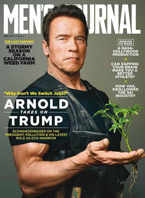
The writing around outside of the cover suggests the idea that they all have a political and social context. For example, the idea that Trump is being challenged by the idea that there are political agendas of these magazines rather than just social context. This is being reinforce in actor performance, Arnold is holding a plant showing his liberal stance on the environment rather than agreeing with his republican president. GQ has a similar idea that there are are social similarities, for example, they are meant to socially accept the idea that women are being attracted by the idea that they are appealing by the female gaze by having their cover star as likable characters.
On the other hand, In the main image of the cover, the two men, although athletically quite similar, Dwayne Johnson has his hands curled up into a fist. This actor performance shows that he is showing off to the spornosexuals who read GQ magazine whereas Schwarzenegger, through actor performance, is shown to have a more subliminal detail. He is holding a hand in his plant suggesting that he has a more political ambitious rather than Johnson who is curling his fists up, this suggests that there are some differences between the two magazines cover.
A key difference to that of the GQ magazine, the cover star on Men's Journal is covering the picture. Rather cleverly, The position of which Schwarzenegger is covering means that the magazine cover says 'ournal' this sounds similar to 'Arnold', the name of the cover star. However, this is not the same on the front cover of the other magazine, in fact, GQ logo is covering their star. This could be to show a stance that no star is bigger than the brand or could be to show of the idea that no man is bigger (in relation to social statue) than another.
The similarities and differences between the demography of the two people are that they are both popular with spornosexuals, in the first instance, there is the idea through the use of the Muscle fit T-shirts and the idea that they bot have muscles showing suggests that they are trying to suggests that they are appealing to their demography through this. However, GQ also has an element of appealing to metrosexuals through the use of the language, this is, it is said to be the big style manual, this suggests to the reader that there is an element of being able of style and the manual to it suggests that they are appealing through this. However, this is not the case when it comes to the fact that there are no such references on the other magazine and therefore they probably do not agree with them.
Therefore representation of men on both of the front covers are similar. For example on the front cover of GQ, men are being represented as strong and tough male look and gaze at the audience. This is done through props and actor performance, the use of the strong posture that Johnson has suggested that the demography of GQ has been gratified. The spornosexuals that have been appealed to are shown through the use of the use of the cover stars performance. This is similar with the other magazine, they are being presented as a strong male influence and cover star of men's journal suggests that they are gratifying there audience through the use of the female gaze and they are, separately, that in the cover of men's journal it is being suggested that they have been given the idea that they are now dealing with other issues not associated stereotypical for men, the environment is being tracked here. All in all the representation of male is in conjunction with the stereotype that they are stronger and more appealing to a female gaze.
The difference between the two also lie in relation with the Men's Journal magazine. Like the mise-en-scene with the GQ magazine, the same is true with the men's journal magazine, this is, that both of these people are fixated on their respected audience. The two are similar as they both have bold expressions that could be similar with what they have in common. They both appeal to a male demography.
The similarities are, not only do they have the same stare and long glare at the audience to promote the idea of a 'man up' expression, but they also have an idea that these two people are essentially objectified. This is, they both are shown with muscles hanging out of a (all in all) muscle fit T-shirt. This reinforces that through the use of props, this effect is being created. Therefore, the idea of objectification is shown through the use of the characters being shown as a strong muscular characters in preparation, before even reading it, that they are showing there physical appearance before readers have even read the surroundings.
The writing around outside of the cover suggests the idea that they all have a political and social context. For example, the idea that Trump is being challenged by the idea that there are political agendas of these magazines rather than just social context. This is being reinforce in actor performance, Arnold is holding a plant showing his liberal stance on the environment rather than agreeing with his republican president. GQ has a similar idea that there are are social similarities, for example, they are meant to socially accept the idea that women are being attracted by the idea that they are appealing by the female gaze by having their cover star as likable characters.
On the other hand, In the main image of the cover, the two men, although athletically quite similar, Dwayne Johnson has his hands curled up into a fist. This actor performance shows that he is showing off to the spornosexuals who read GQ magazine whereas Schwarzenegger, through actor performance, is shown to have a more subliminal detail. He is holding a hand in his plant suggesting that he has a more political ambitious rather than Johnson who is curling his fists up, this suggests that there are some differences between the two magazines cover.
A key difference to that of the GQ magazine, the cover star on Men's Journal is covering the picture. Rather cleverly, The position of which Schwarzenegger is covering means that the magazine cover says 'ournal' this sounds similar to 'Arnold', the name of the cover star. However, this is not the same on the front cover of the other magazine, in fact, GQ logo is covering their star. This could be to show a stance that no star is bigger than the brand or could be to show of the idea that no man is bigger (in relation to social statue) than another.
The similarities and differences between the demography of the two people are that they are both popular with spornosexuals, in the first instance, there is the idea through the use of the Muscle fit T-shirts and the idea that they bot have muscles showing suggests that they are trying to suggests that they are appealing to their demography through this. However, GQ also has an element of appealing to metrosexuals through the use of the language, this is, it is said to be the big style manual, this suggests to the reader that there is an element of being able of style and the manual to it suggests that they are appealing through this. However, this is not the case when it comes to the fact that there are no such references on the other magazine and therefore they probably do not agree with them.
Therefore representation of men on both of the front covers are similar. For example on the front cover of GQ, men are being represented as strong and tough male look and gaze at the audience. This is done through props and actor performance, the use of the strong posture that Johnson has suggested that the demography of GQ has been gratified. The spornosexuals that have been appealed to are shown through the use of the use of the cover stars performance. This is similar with the other magazine, they are being presented as a strong male influence and cover star of men's journal suggests that they are gratifying there audience through the use of the female gaze and they are, separately, that in the cover of men's journal it is being suggested that they have been given the idea that they are now dealing with other issues not associated stereotypical for men, the environment is being tracked here. All in all the representation of male is in conjunction with the stereotype that they are stronger and more appealing to a female gaze.
