Pride
| pride.pdf |
Notes From End of Year 9 Exam


Component 1: Section A – Question 1a) (b) and (c) Explore how the …….(cover) for ……(pride) uses the following elements of
media language to create meanings:
(a) images [5]
(b) language [5]
(c) layout and design [5]
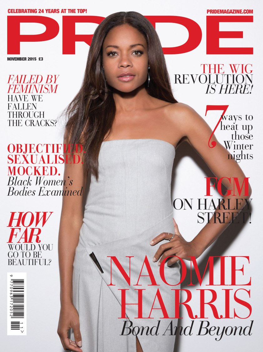
On the front cover of pride magazine there is a picture of Naomi Harris. She is standing in a central position in the pride magazine. This connotes that she is the protagonist and is in a controlling position as she has a stance which connotates sassy-ness . As pride is a magazine came out in the 1950's and 60's, it came at a time where racial tension were high and therefore many black people saw an influence from the pride magazine franchise. As Harris is in a high posture. She is not being objectified and so this gives us insight into the magazines purpose, this being that it is a purpose for black pride, The image reinforces this with her 'sassy-ness' to portray how she feels, and the black community feel an experience of representation. With regards to her not being objectified this can show that the magazine's objective is not one of aesthetics but rather of a more political orientation of black power creating a psychographic element to the cover. Another noticeable feature of the image is that Harris is wearing a white dress. This is contrasted with her skin colour, which is black and she is being portrayed as a focused, potentially on a goal of black rights, with her eyes being fixated on the audience. Her dress is not particularly flattering but more formal, connoting that she dose not what to be aesthetically appealing but rather focused on the audience in a powerful convergence of statute. A further key feature is that she has a hand relaxed at one side. This connotes that she is relaxed in nature, as in she is trying to show that she may be relaxed so people would not think it is too harsh but is directly contrasted with her other arm which is a controlling posture. This could also be to do with feminine power as she is in a stereotypical male posture on her other arm.
There is use of alliteration on the cover, this is, "Bond And Beyond". This appeals to the audience because it shows her background, Miss Money-penny in the Bond franchise but the use of beyond can show that she is using her fame in a more revolutionary way both in feminism and black power movement.This can be an example of intertextuality. However, there is an almost contrast with this as alliteration is used again but this time it is 'Failed by feminism' this connotes that what the goals that people have been trying to achieve have failed and that they have 'fallen through the cracks' this could mean that one of the goals trying to be reinforced have failed. Also, when we look at the phrase 'revolutionary wig', this personifies the idea that the people reading this are trying to familiarize themselves with a strong message and, though do not mean revolution in a forceful way, are attempting to get their message across using powerful and strong language to convey such a message and this time that it is not meant in a passive way. The use of 'FGM on Harley street!" conveys a strong message, through the use of punctuation. The use of an exclamation mark connotes the severity of this issue that they wish to discuss is important. Harley street is a prestigious area and the issue that they wish to discuss must be highly important. 'Objectified. Sexualised. Mocked.' all connote that someone has been downtrodden and are oppressed. This reinforces the idea that people are being exploited for their own personal gain. Objectified connotes that they are being exploited by a male audience an bellow reads 'Black Women's bodies examined', these then reinforces their belief on how they can make a better and more equal world.w
Naomi Harris is covering the I in the Pride magazine cover. This could be connoted as a political statement, in so much as she is trying to make it known who she is and her race (black civil rights where and can still today be seen as a controversial topic). They may have covered the I because they rely on people to familiarize themselves with this franchise and so they place Harris in the center to convey their strong stance as mentioned earlier. All of the headings are in a bold red font and the picture of Harris is anchored with a description of who she is and the statement the alliteration describing her role. There are smaller fonts going to higher fonts from top to bottom of this page, these combine to capture the audiences attention and make them wish to read what is going on and what they can do by reading these captive headlines. The text are positioned around the main image, this could connote that the magazine wish for their magazine's cover star's controlling posture to be wiped out by the subheadings and make the cover more appealing to the audience of Pride. The font of the title of the cover is in the biggest font of all, a large red title dominates the cover, again so audiences can familiarize themselves on what they are reading. There is also a small heading above the title, this is a strap line that shows how they are familiarized, 'celebrating 24 years at the top', this connotes that they believe that they are the best of the category that they are in, these continue throughout the rest of this front cover. All in all, the magazine has put their cover star in the center to draw attention through a familiar actress and have placed their other topics around her to gain audience. The unique features of Pride's mean it gives a USP. This is a method that certain publishers use to get their magazine across to different members of the public. (Sorry i couldn't do much its just ur a bloody legend and have it all covered.)
GQ

| gq.pdf |
